Case Study — The Sutherland Group

Brand System Design & Multi-Company Identity

Overview


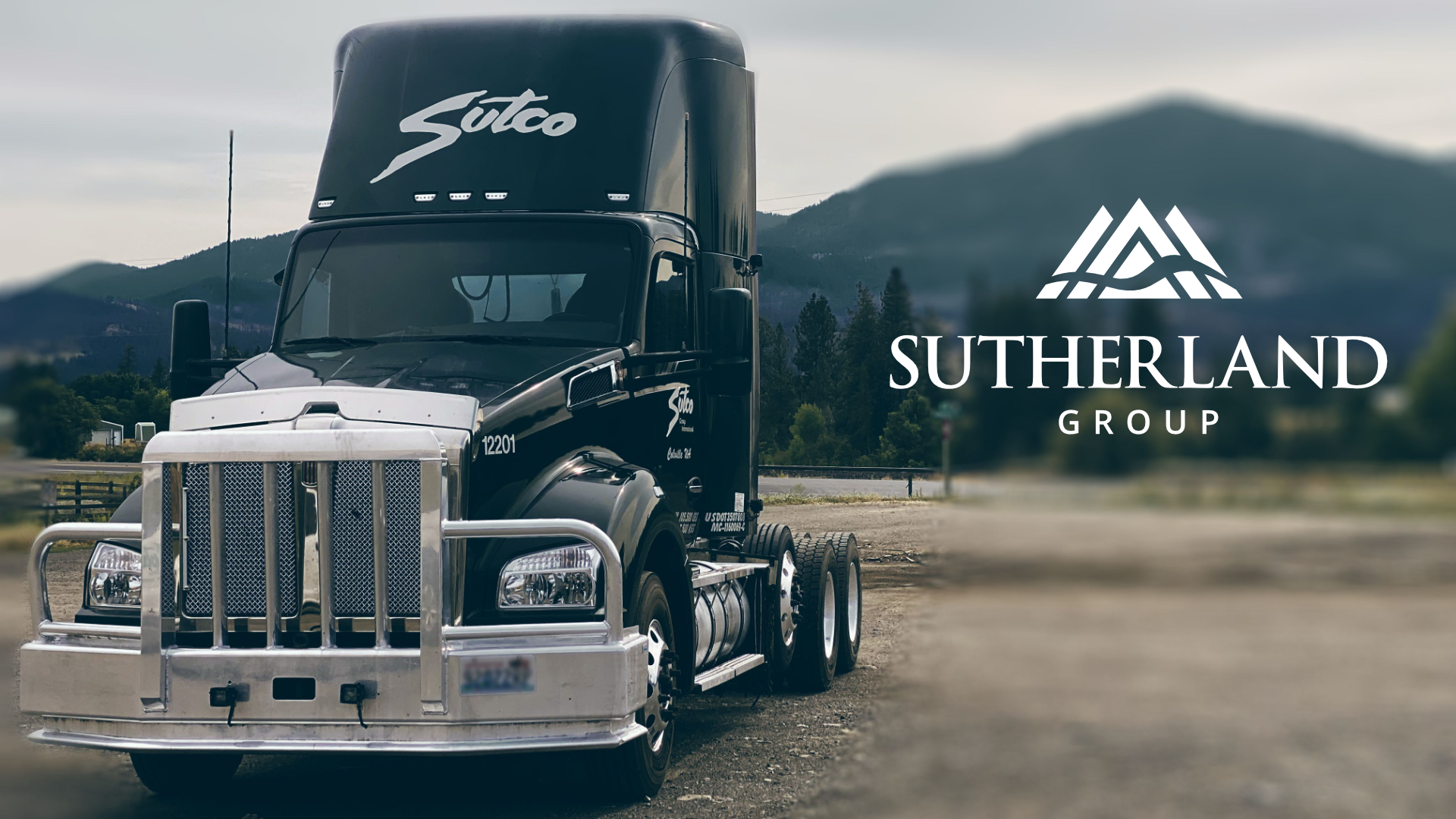
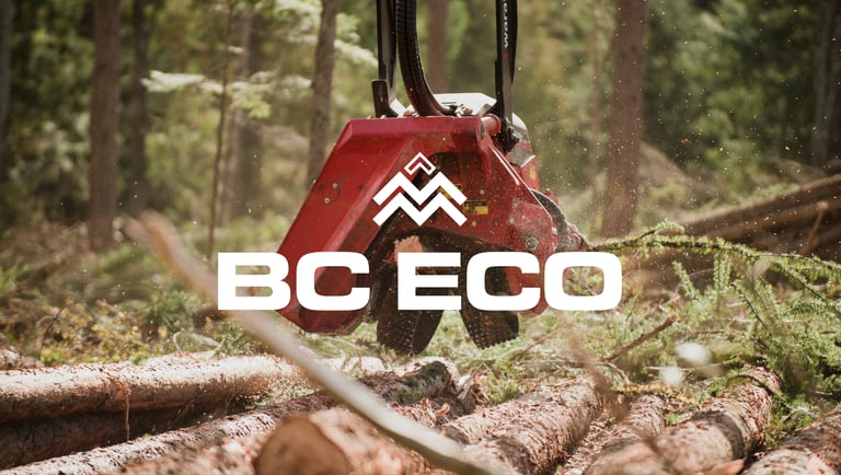
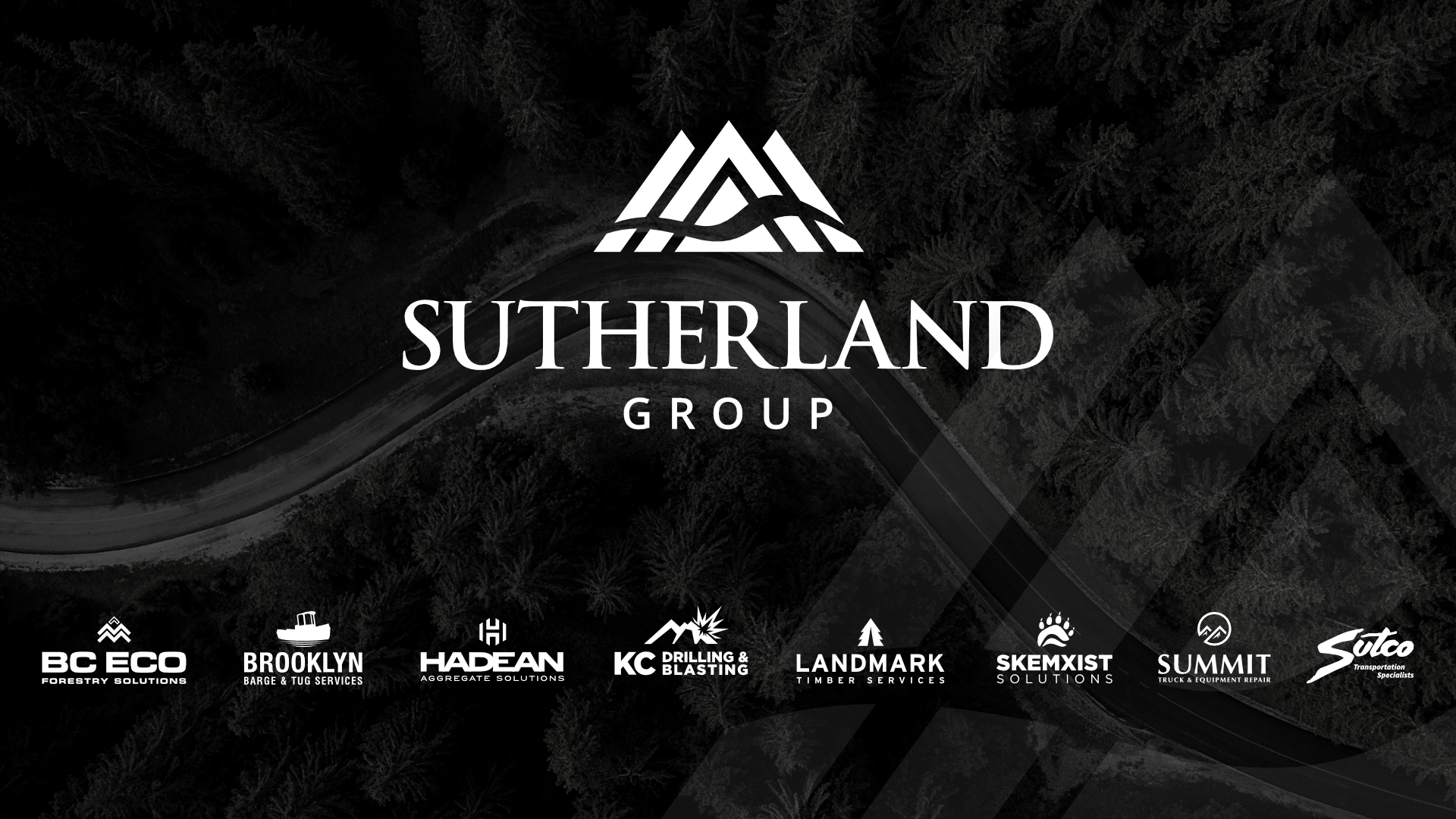
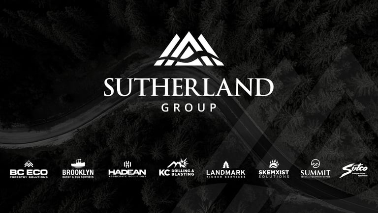
The Sutherland Group is an integrated network of companies operating across civil, forestry, transportation, and marine industries. The goal of this project was to establish a cohesive and professional brand identity for the umbrella organization, while unifying the visual language across its multiple subsidiaries.

I was responsible for designing the core brand system and applying it across a wide range of touchpoints, from logos and guidelines to digital, print, and internal communications.

Challenge


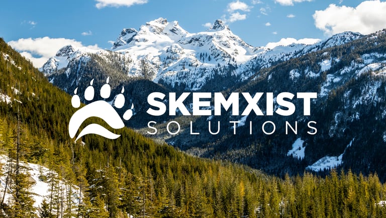
The Sutherland Group operates as a collective of specialized companies, each with its own identity and operational focus. Prior to this project, there was a lack of visual consistency across the group, making it difficult to present a unified, professional image.

The challenge was twofold:

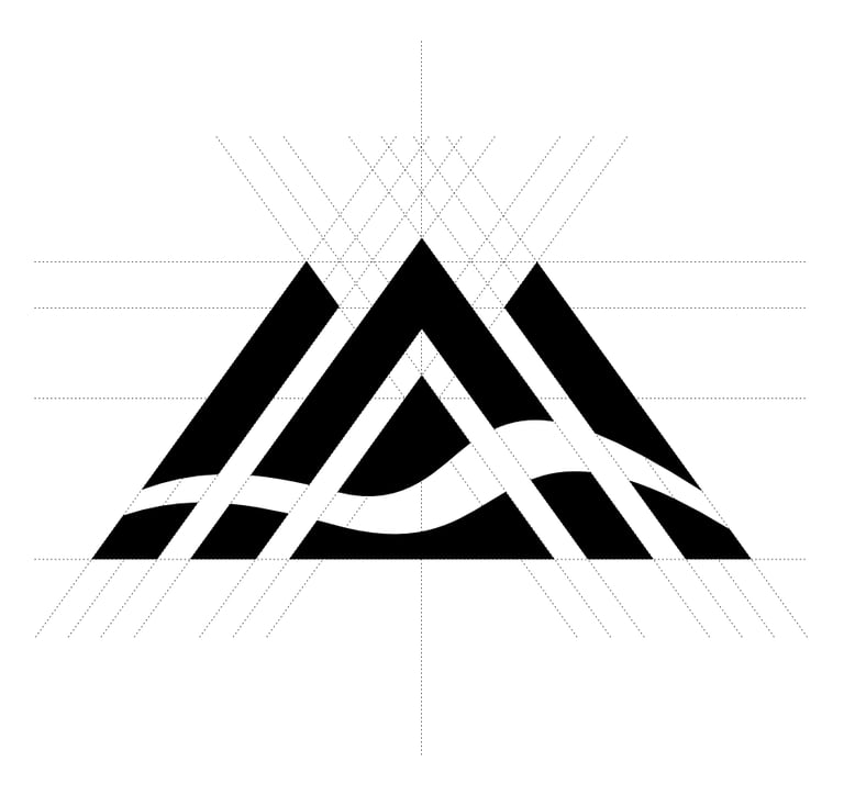
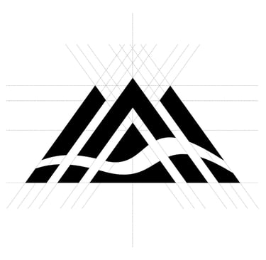
  • Create a strong, recognizable identity for the parent brand

  • Develop a scalable system that brings consistency across all subsidiaries without removing their individuality

The solution needed to work across industries, platforms, and use cases—from corporate presentations to heavy equipment branding.

Approach


I approached the project as a modular brand system, rather than a single identity.

The foundation was built around a central visual language that reflects the company’s core values: reliability, adaptability, collaboration, and execution. From there, I developed a flexible framework that could be consistently applied across all companies and media.

Key considerations included:

  • Scalability across multiple brands and future expansion

  • Clarity and legibility in both digital and physical environments

  • Consistency across internal and external communication

  • Ease of use for teams applying the brand day-to-day

Solution

Brand Identity (Sutherland Group)
I designed the primary identity for The Sutherland Group, including logo, typography, and color system.

The logo combines symbolic elements—mountains, directional arrows, and a flowing line—representing growth, movement, infrastructure, and connection across industries. The visual language balances strength and clarity with subtle references to landscape and logistics.

A restrained color palette (black, dark forest green, and supporting neutrals) reinforces a professional, industrial tone while allowing flexibility in application.

Subsidiary System


I designed logos for multiple subsidiaries (including BC Eco, KC Drilling & Blasting, and Skemxist Solutions), aligning them within a unified structure.

Each company maintains its own identity through color and form, while adhering to a shared system:

  • Consistent logo construction and layout logic

  • Standardized pairing with the parent brand

  • A unified “A Sutherland Group Company” endorsement

  • Structured hierarchy across all applications

This ensures visual cohesion while allowing each company to remain distinct.

Design System & Guidelines


I created a comprehensive set of brand guidelines to ensure consistency across all use cases.

This included:

  • Logo usage rules and pairing systems

  • Color palettes and gradients

  • Typography hierarchy (Open Sans, Rubik, Source Sans)

  • Iconography and visual language

  • Image direction and photography standards

  • Layout structures for digital and print

The system was designed to be practical and scalable, enabling internal teams to apply the brand consistently without ambiguity.

Applications


The brand system was implemented across a wide range of materials, including:

  • Business cards and corporate stationery

  • Social media profiles and content templates

  • Website design elements

  • Presentation decks and investor materials

  • Internal newsletters and communications

  • Apparel and branded equipment

Each application reinforces the same visual language, ensuring consistency across both internal and external touchpoints.

Outcome


The result is a cohesive, professional brand ecosystem that unifies The Sutherland Group and its subsidiaries under a single visual identity.

The system supports clarity, recognition, and scalability, allowing the organization to present itself consistently across industries and platforms. It also provides a strong foundation for future growth, enabling new companies to be integrated seamlessly into the brand structure.